
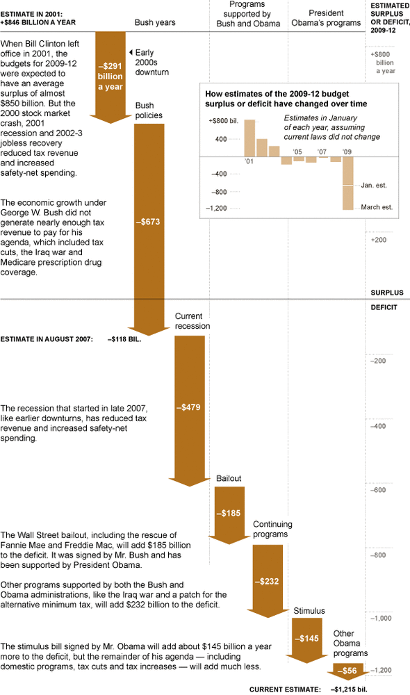
This is an interesting graphic that tells the story of the culprits behind our budget deficit.
The NYT article from a couple days ago breaks it down in further detail, as shown below.

Just thought I’d share.
Discover more from stevebanfield.blog
Subscribe to get the latest posts sent to your email.
