I don’t do a lot of product “reviews” on here. Mostly I try to focus on what I’m using and why I’m using it. Occasionally I’ll try an experiment with a new device, or using something in a new way, for my own learning.
So I’ll do a quick departure for a “mini” review of the Nexus 5 Bumper Case from Google. Overall I like it, it feels good, protects the phone, blah blah blah, blah blah. It’s a bumper case, what more do you need?
Except it’s the wrong color. It’s not the wrong color because I ordered incorrectly, or Google didn’t ship the color I ordered. I ordered red. I got orange, and Google seems to think that’s red.
My new case is not just a single orange but in fact two-tone orange. It’s almost the shades of “safety orange” you wear in the woods around hunting season so you don’t get mistaken for a whitetail by someone with Winchester and bad eyesight.
Here’s the image from Google’s Play Store
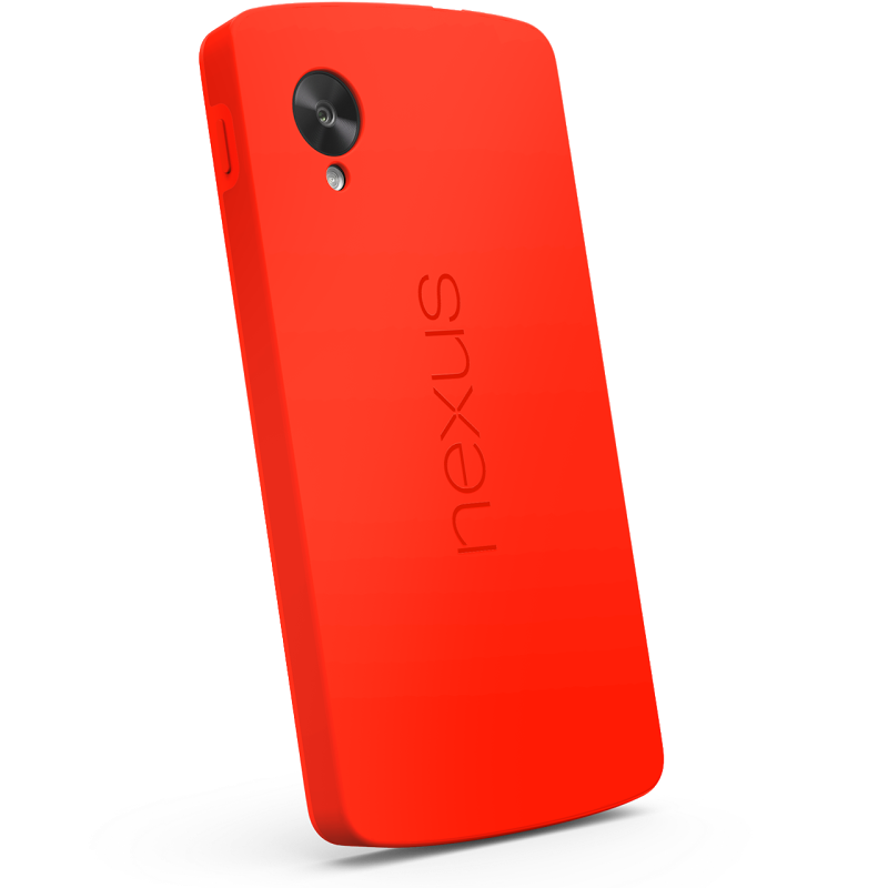
That looks red to me. Not orange but definitely a vibrant, bright red. I didn’t notice before I ordered but you can see some element of the “two-tone” around the power button to the left of the camera lens. In the store Google just refers to this as “red” but in the URL for the store link it says “Nexus_5_Bumper_Case_Bright_Red”.
Now here are some shots I took of the case on my Nexus 5 in natural light using my Sony RX100 II.
See the difference? I would have preferred a deeper, richer red instead of safety orange. I’ve gotten used to it and in the end it seems to be doing what I’d like it to do. It certainly makes my phone stand out.
Just make sure you know what color you want, or think you’ll get, before you order. Because to Google Orange isn’t the new black, it’s the new Red.
Discover more from stevebanfield.blog
Subscribe to get the latest posts sent to your email.
